Base Plotting
Last Updated: 20, November, 2025 at 09:27
- Notes
- Read in some data
- Basic plot type: lines and scatter
- Basic plot type: histogram
- Basic plot type: barchart
- Basic plot type: boxplot
- Adding stuff to existing plots
- Adding legends
- Exercise
Notes
The base plotting system in R is somewhat dated (we’ll run into some limits below). But it is still a way of creating simple plots programmatically. I think these this approach is good for quick plots while processing and exploring data. Or for very simple plots. This is an online article that shows some more advanced use of the base plotting system: here.
At the other end of the spectrum, is ggplot2 (part of the tidyverse) which is a very powerful plotting system that allows creating complex plots with relative ease. But it takes time to get used to it. Luckily, there are some intermediate solutions:
| Package | Description | Examples/Tutorials |
|---|---|---|
lattice |
Powerful multi-panel plots with simpler syntax than ggplot2. | Lattice Gallery |
plotly |
Interactive, web-based plots with hover tooltips and zooming. | Plotly R Examples |
easyGgplot2 |
[NO LONGER WORKS - USE GGPUBR]Simplifies ggplot2 syntax for common tasks. | easyGgplot2 Vignette |
esquisse |
RStudio add-in for drag-and-drop ggplot2 plot creation. | esquisse Demo |
patchwork |
Simplifies combining and arranging ggplot2 plots. | patchwork Examples |
ggpubr |
Extends ggplot2 for publication-ready plots with one-line functions. | ggpubr Gallery |
Read in some data
This is the data source.
library(tidyverse)
## ── Attaching core tidyverse packages ──────────────────────── tidyverse 2.0.0 ──
## ✔ dplyr     1.1.4     ✔ readr     2.1.5
## ✔ forcats   1.0.1     ✔ stringr   1.5.2
## ✔ ggplot2   4.0.0     ✔ tibble    3.3.0
## ✔ lubridate 1.9.4     ✔ tidyr     1.3.1
## ✔ purrr     1.1.0
## ── Conflicts ────────────────────────────────────────── tidyverse_conflicts() ──
## ✖ dplyr::filter() masks stats::filter()
## ✖ dplyr::lag()    masks stats::lag()
## ℹ Use the conflicted package (<http://conflicted.r-lib.org/>) to force all conflicts to become errors
body_data <- read_csv('data/body.csv')
## Rows: 507 Columns: 25
## ── Column specification ────────────────────────────────────────────────────────
## Delimiter: ","
## dbl (25): Biacromial, Biiliac, Bitrochanteric, ChestDepth, ChestDia, ElbowDi...
##
## ℹ Use `spec()` to retrieve the full column specification for this data.
## ℹ Specify the column types or set `show_col_types = FALSE` to quiet this message.
head(body_data)
## # A tibble: 6 × 25
##   Biacromial Biiliac Bitrochanteric ChestDepth ChestDia ElbowDia WristDia
##        <dbl>   <dbl>          <dbl>      <dbl>    <dbl>    <dbl>    <dbl>
## 1       42.9    26             31.5       17.7     28       13.1     10.4
## 2       43.7    28.5           33.5       16.9     30.8     14       11.8
## 3       40.1    28.2           33.3       20.9     31.7     13.9     10.9
## 4       44.3    29.9           34         18.4     28.2     13.9     11.2
## 5       42.5    29.9           34         21.5     29.4     15.2     11.6
## 6       43.3    27             31.5       19.6     31.3     14       11.5
## # ℹ 18 more variables: KneeDia <dbl>, AnkleDia <dbl>, Shoulder <dbl>,
## #   Chest <dbl>, Waist <dbl>, Navel <dbl>, Hip <dbl>, Thigh <dbl>, Bicep <dbl>,
## #   Forearm <dbl>, Knee <dbl>, Calf <dbl>, Ankle <dbl>, Wrist <dbl>, Age <dbl>,
## #   Weight <dbl>, Height <dbl>, Gender <dbl>
try(dev.off()) # Make sure all graphic parameters are reset
## null device
##           1
Basic plot type: lines and scatter
Scatter plot
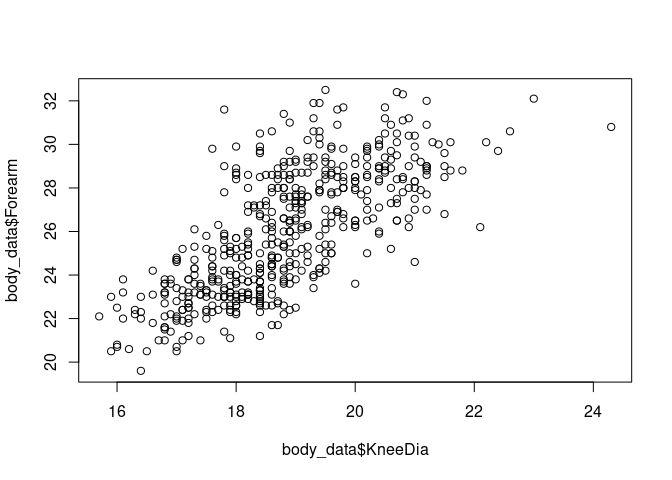
plot(body_data$KneeDia, body_data$Forearm)
Line plot
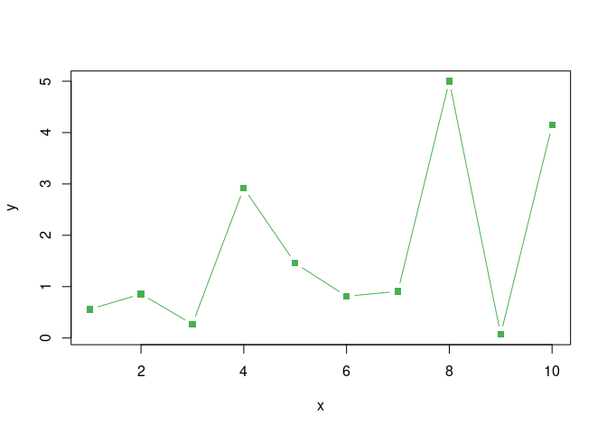
x <- 1:10
y <- runif(10) * x
plot(x, y, type= 'l')
plot(x, y, type= 'b')
Setting colors and markers
See
here
for a list of pch marker values. See
here for a list
of color names R knows out of the box.
x <- 1:10
y <- runif(10) * x
plot(x, y, type= 'b', pch=15, col ='red2')
R also knows about hex colors.
x <- 1:10
y <- runif(10) * x
plot(x, y, type= 'b', pch=15, col ='#47B04E')
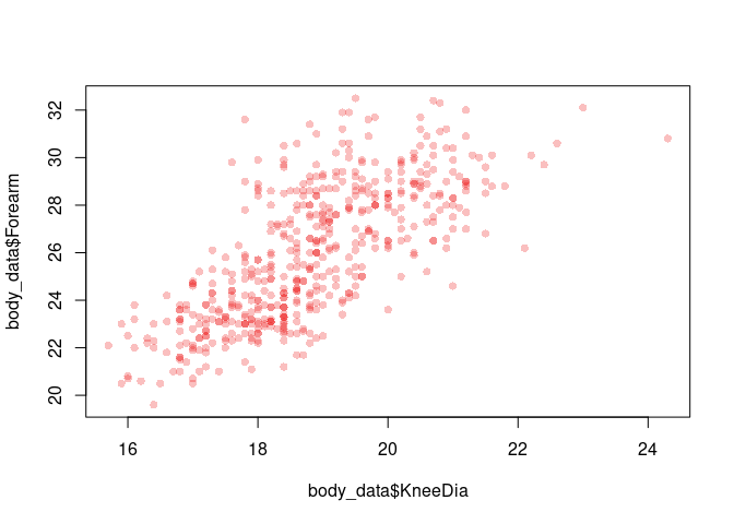
Handy Dandy: adding an alpha channel to a color
my_red <- adjustcolor( "red2", alpha.f = 0.25) #This creates a red color with 25% opacity
plot(body_data$KneeDia, body_data$Forearm, pch=16, col=my_red)
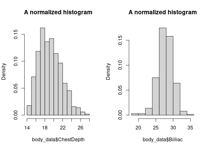
Basic plot type: histogram
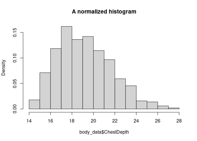
The hist() function has a number of interesting arguments:
- main
- xlab, ylab
- freq
hist(body_data$ChestDepth, freq = FALSE, main ='A normalized histogram')
Basic plot type: barchart
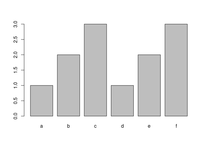
Some interesting arguments:
- names.arg
labels <- c('a', 'b', 'c', 'd', 'e', 'f')
values <- c(1, 2, 3, 1, 2, 3)
barplot(values, names.arg = labels)
Basic plot type: boxplot
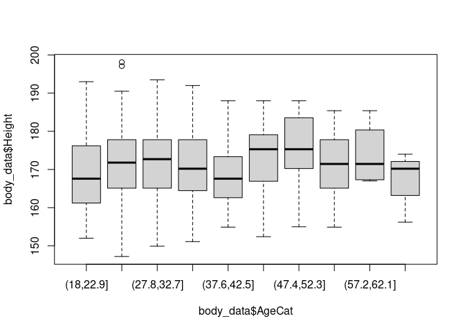
body_data$AgeCat <- cut(body_data$Age, 10)
boxplot(body_data$Height ~ body_data$AgeCat)
Setting plot parameters
The function par() allows setting parameters for subsequent plots.
Most importantly, you can set the subsequent plots’ margins and number
of of subplots.
Setting the inner and the outer margins
You can find more information about inner and outer margins in R here.
par(oma=c(0,0,0,0))
x <- 1:10
y <- runif(10) * x
plot(x, y, type= 'l')
Plotting subplots
par(mfcol = c(1,2))
hist(body_data$ChestDepth, freq = FALSE, main ='A normalized histogram')
hist(body_data$Biiliac, freq = FALSE, main ='A normalized histogram')
try(dev.off()) # Make sure all graphic parameters are reset
## null device
##           1
- mfrow and mfcol plot orders:
https://r-charts.com/base-r/combining-plots/
Changing text and font
Adding labels
- axis labels:
xlab =,ylab = - subtitle:
sub = - title:
main =
Changing the font face
font face: font =
- values: 1 (plain), 2 (bold), 3 (italic), or 4 (bold italic)
font family: family =
- “serif”, “sans”, or “mono”
Scaling text sizes
- scaling all elements:
cex = - scaling axis labels:
cex.lab = - scaling subtitle:
cex.sub = - scaling tick mark labels:
cex.axis = - scaling title:
cex.main =
Example
plot(x, y, type= 'b', family='serif', main='Some title', cex=1.25)

Adding stuff to existing plots
Adding points or lines
plot(body_data$KneeDia, body_data$Forearm)
points(c(18, 20, 22), c(22, 23, 24), type='b', col='red2')
points(c(18, 20, 22), c(23, 24, 25), col='blue2')
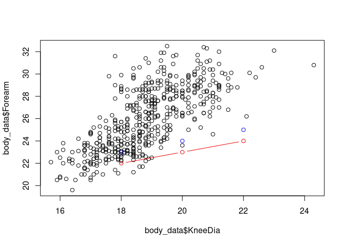
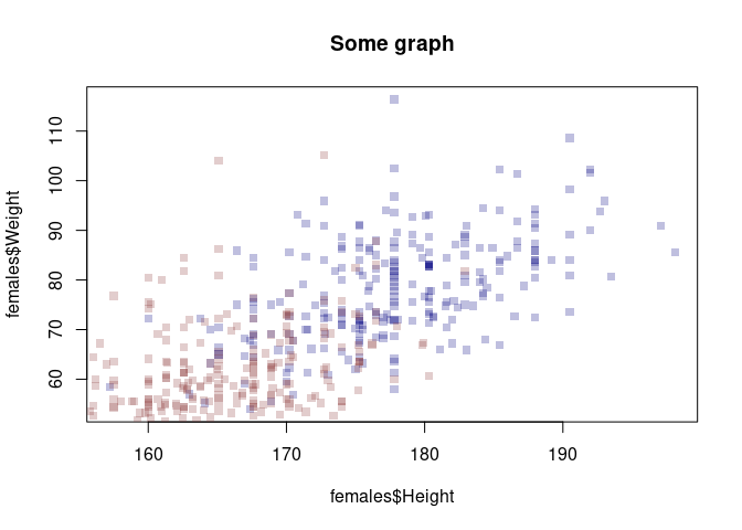
A limitation of R
This does cuts the range of the plot to the range of the first plotted data!
my_blue <- adjustcolor( "navyblue", alpha.f = 0.25)
my_red <- adjustcolor( "indianred4", alpha.f = 0.25)

males <- body_data[body_data$Gender==0,]
females <- body_data[body_data$Gender==1,]

plot(females$Height, females$Weight, pch=15, main='Some graph', col=my_blue)
points(males$Height, males$Weight, pch=15, main='Some graph', col=my_red)
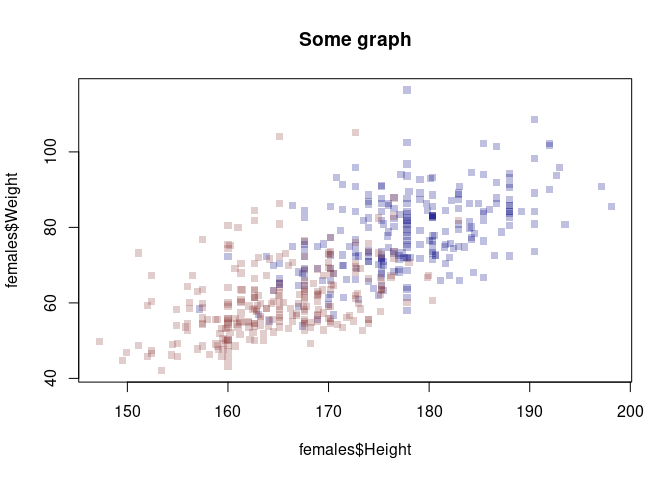
This solves the problem. But it’s a bit dissapointing that R does not update the axes of the plots.
my_blue <- adjustcolor( "navyblue", alpha.f = 0.25)
my_red <- adjustcolor( "indianred4", alpha.f = 0.25)

xrange <- range(body_data$Height)
yrange <- range(body_data$Weight)

males <- body_data[body_data$Gender==0,]
females <- body_data[body_data$Gender==1,]

plot(females$Height, females$Weight, pch=15, main='Some graph', col=my_blue, xlim = xrange, ylim = yrange)
points(males$Height, males$Weight, pch=15, main='Some graph', col=my_red)
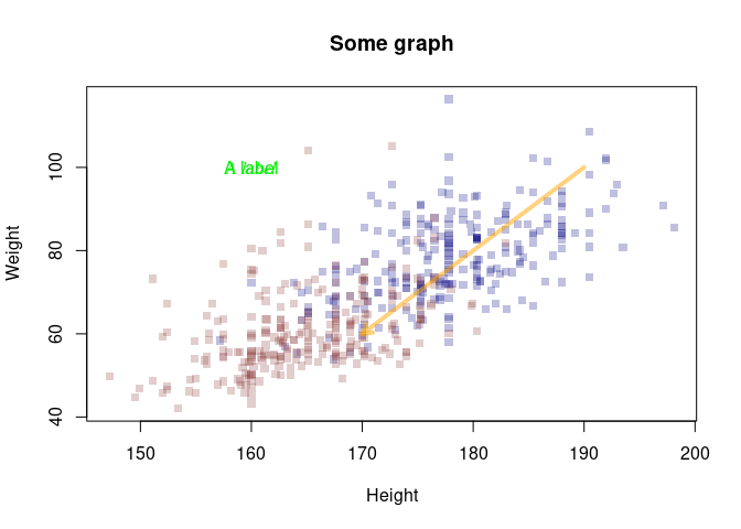
More bling
my_blue <- adjustcolor( "navyblue", alpha.f = 0.25)
my_red <- adjustcolor( "indianred4", alpha.f = 0.25)
my_orange <- adjustcolor( "orange", alpha.f = 0.5)

xrange <- range(body_data$Height)
yrange <- range(body_data$Weight)

males <- body_data[body_data$Gender==0,]
females <- body_data[body_data$Gender==1,]

plot(females$Height, females$Weight, pch=15, main='Some graph', col=my_blue, xlim = xrange, ylim = yrange, xlab='Height', ylab='Weight')
points(males$Height, males$Weight, pch=15, main='Some graph', col=my_red)

# Add a label to the graph
text(x=160, y=100, labels='A label', col="green2")
# Add a label to the graph
text(x=190, y=50, labels='A label', col="blue", font=3, family='serif')
# Add an arrow
arrows(x0=190, y0=100, x1=170,y1=60, length = 0.1, lwd=4, col=my_orange)
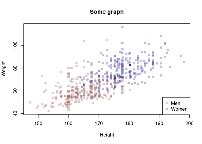
Adding legends
Adding legends can be done using the legend(). These are the main
arguments to the function:
- x and y : the x and y co-ordinates to be used to position the legend
- legend : the text of the legend
You can set the location using a keyword, i.e. x= “bottomright”,
“bottom”, “bottomleft”, “left”, “topleft”, “top”, “topright”, “right” or
“center”.
Apart from the location of the legend and the text to appear, you have to provide some parameters that set the legend’s markers.
my_blue <- adjustcolor( "navyblue", alpha.f = 0.25)
my_red <- adjustcolor( "indianred4", alpha.f = 0.25)
my_orange <- adjustcolor( "orange", alpha.f = 0.5)

xrange <- range(body_data$Height)
yrange <- range(body_data$Weight)

males <- body_data[body_data$Gender==0,]
females <- body_data[body_data$Gender==1,]

plot(females$Height, females$Weight, pch=15, main='Some graph', col=my_blue, xlim = xrange, ylim = yrange, xlab='Height', ylab='Weight')
points(males$Height, males$Weight, pch=15, main='Some graph', col=my_red)

# Add the legend - notice: we have to set the colors and markers for the legend manually
legend('bottomright', c('Men', 'Women'), col = c(my_red, my_blue), pch=15)
Exercise
Use these data:
body_data <- read_csv('data/body.csv')
## Rows: 507 Columns: 25
## ── Column specification ────────────────────────────────────────────────────────
## Delimiter: ","
## dbl (25): Biacromial, Biiliac, Bitrochanteric, ChestDepth, ChestDia, ElbowDi...
##
## ℹ Use `spec()` to retrieve the full column specification for this data.
## ℹ Specify the column types or set `show_col_types = FALSE` to quiet this message.
-
Create a histogram of people’s height, split out by gender. Overlay the histogram for women and men (use an alpha setting to make both of them visible). Make sure the histogram shows all data and is not cut off.
-
Plot a bar chart of people’s height. Use 10-year age bins on the x-axis.
-
Create a cumulative histogram of people’s height (or any other variable).
Potential solution
# Preparation
male_color <- adjustcolor( "navyblue", alpha.f = 0.25)
female_color <- adjustcolor( "indianred4", alpha.f = 0.25)

#Create 10Y age bins
body_data <- mutate(body_data, AgeCat= round(Age/10)*10) #Truncate to tens

# This illustrates the transformation we've done
plot(body_data$Age, body_data$AgeCat)
points(25, 20, col='red', pch=16)
points(26, 30, col='green', pch=16)

points(35, 30, col='red', pch=16)
points(36, 40, col='green', pch=16)

#Split out the data
male_data <- filter(body_data, Gender==1)
female_data <- filter(body_data, Gender==0)

# We could use the histogram function here.
# But sometimes it makes sense to think outside the box

library(janitor)
##
## Attaching package: 'janitor'

## The following objects are masked from 'package:stats':
##
##     chisq.test, fisher.test
male_counts <- tabyl(male_data$AgeCat)
female_counts <- tabyl(female_data$AgeCat)
# This just makes things more handy
male_counts <- rename(male_counts, AgeCat = 'male_data$AgeCat')
female_counts <- rename(female_counts, AgeCat = 'female_data$AgeCat')
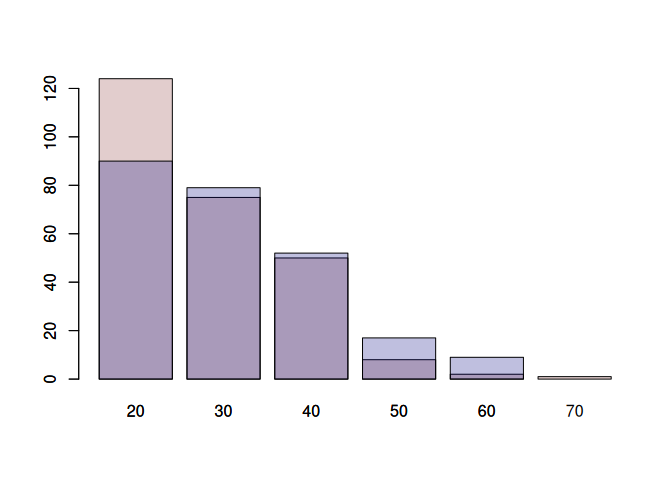
# Plotting the females first makes things easier:
# There are more age categories in the females
# The counts are higher
# Therefore, by plotting the females first, we make sure that all bars are labeled.
barplot(female_counts$n, names.arg = female_counts$AgeCat, col=female_color)
barplot(male_counts$n, names.arg = male_counts$AgeCat, col=male_color, xlab='Age Category', ylab='Count', main='Age distribution by gender', add=TRUE)
The previous exercise highlighted that the old plotting system in R is clunky. Therefore, people have designed a new plotting system: ggplot2 (part of the tidyverse). I have a section on this in the next file. But here is a simple example to show how we could recreate the previous plot using ggplot2.
The downside of ggplot2 is that it takes time to get used to it.
library(tidyverse)
body_data <- read_csv('data/body.csv')
## Rows: 507 Columns: 25
## ── Column specification ────────────────────────────────────────────────────────
## Delimiter: ","
## dbl (25): Biacromial, Biiliac, Bitrochanteric, ChestDepth, ChestDia, ElbowDi...
##
## ℹ Use `spec()` to retrieve the full column specification for this data.
## ℹ Specify the column types or set `show_col_types = FALSE` to quiet this message.
male_color <- adjustcolor( "navyblue", alpha.f = 0.25)
female_color <- adjustcolor( "indianred4", alpha.f = 0.25)

body_data <- mutate(body_data, AgeCat= round(Age/10)*10) #Truncate to tens
basic_plot <- ggplot(body_data)
basic_plot <- basic_plot + aes(x=AgeCat, fill=factor(Gender))
basic_plot <- basic_plot + geom_bar(position='identity', alpha=0.5)
basic_plot <- basic_plot + scale_fill_manual(values=c(female_color, male_color), labels=c('Female', 'Male'))

# Initialize a ggplot object using the 'body_data' dataset
basic_plot <- ggplot(body_data)

# Define the aesthetics for the plot:
# - x-axis: AgeCat (age groups in decades)
# - fill: Gender (converted to a factor for categorical coloring)
basic_plot <- basic_plot + aes(x = AgeCat, fill = factor(Gender))

# Add bar geometry to the plot:
# - position='identity' overlays bars for each gender (no stacking or dodging)
# - alpha=0.5 makes bars semi-transparent for better visibility of overlaps
basic_plot <- basic_plot + geom_bar(position = 'identity', alpha = 0.5)

# Customize the fill colors and legend labels:
# - values: Use predefined colors for females and males (e.g., female_color, male_color)
# - labels: Set legend labels to 'Female' and 'Male'
basic_plot <- basic_plot + scale_fill_manual(values = c(female_color, male_color), labels = c('Female', 'Male'))
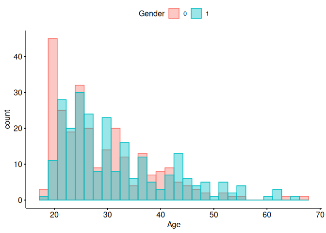
Let’s do the same thing with the easy version of ggplot2, ggpubr.
library(ggpubr)
body_data$Gender <- factor(body_data$Gender)
gghistogram(
  data = body_data,
  x = "Age",
  color = "Gender",
  fill = "Gender",
  position = "identity",
  alpha = 0.4,
  legend = "top"
)
## Warning: Using `bins = 30` by default. Pick better value with the argument
## `bins`.
 ##
More exercises
##
More exercises
The internet is full of exercises on plotting in R (using the base plotting system). Here are two selected resources:
This one uses the cars data we have already used in the course (I’ved added it to the data folder):
https://www.r-exercises.com/2016/09/23/advanced-base-graphics-exercises/